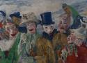
The emergence of synthetic pigments in the 19th century had an immense impact on the art world, particularly the availability of emerald-green pigments, prized for their intense brilliance by such masters as Paul Cézanne, Edvard Munch, Vincent van Gogh, and Claude Monet. The downside was that these pigments often degraded over time, resulting in cracks and uneven surfaces and the formation of dark copper oxides—even the release of arsenic compounds.
Naturally, it’s a major concern for conservationists of such masterpieces. So it should be welcome news that European researchers have used synchrotron radiation and various other analytical tools to determine whether light and/or humidity are the culprits behind that degradation and how, specifically, it occurs, according to a paper published in the journal Science Advances. //
The results: In the mockups, light and humidity trigger different degradation pathways in emerald-green paints. Humidity results in the formation of arsenolite, making the paint brittle and prone to flaking. Light dulls the color by causing trivalent arsenic already in the pigment to oxidize into pentavalent compounds, forming a thin white layer on the surface. Those findings are consistent with the analyzed samples taken from The Intrigue, confirming the degradation is due to photo-oxidation. Light, it turns out, is the greatest threat to that particular painting, and possibly other masterpieces from the same period.


A decade ago, an employee stole 25 priceless documents from the Netherlands’ National Archives in the Hague. The trove included 16th-century records of clandestine government affairs, a 15th-century letter from a knight and documents from the Dutch East India Company.
Officials weren’t aware the documents had been stolen until recently, when they were returned by the Amsterdam police and art detective Arthur Brand, who is known for recovering lost and stolen artworks and artifacts. //
Officials at the archives knew that the documents were missing, but they assumed they had simply been misplaced. “We manage more than [90 miles] of archives, over 15 million photographs and 300,000 maps and drawings,” a spokesperson for the National Archives tells NL Times. “With such numbers, it is impossible to have a complete inventory of all the documents.”
Removable transparent films apply digital restorations directly to damaged artwork.
MIT graduate student Alex Kachkine once spent nine months meticulously restoring a damaged baroque Italian painting, which left him plenty of time to wonder if technology could speed things up. Last week, MIT News announced his solution: a technique that uses AI-generated polymer films to physically restore damaged paintings in hours rather than months. The research appears in Nature.
Kachkine's method works by printing a transparent "mask" containing thousands of precisely color-matched regions that conservators can apply directly to an original artwork. Unlike traditional restoration, which permanently alters the painting, these masks can reportedly be removed whenever needed. So it's a reversible process that does not permanently change a painting.
"Because there's a digital record of what mask was used, in 100 years, the next time someone is working with this, they'll have an extremely clear understanding of what was done to the painting," Kachkine told MIT News. "And that's never really been possible in conservation before."
Nature reports that up to 70 percent of institutional art collections remain hidden from public view due to damage—a large amount of cultural heritage sitting unseen in storage. Traditional restoration methods, where conservators painstakingly fill damaged areas one at a time while mixing exact color matches for each region, can take weeks to decades for a single painting. It's skilled work that requires both artistic talent and deep technical knowledge, but there simply aren't enough conservators to tackle the backlog. //
For now, the method works best with paintings that include numerous small areas of damage rather than large missing sections. In a world where AI models increasingly seem to blur the line between human- and machine-created media, it's refreshing to see a clear application of computer vision tools used as an augmentation of human skill and not as a wholesale replacement for the judgment of skilled conservators.
Many conservatives have bought into this common notion that, while pornography is immoral, nudity in high art is permissible. Often, these arguments tie into the concept that truth, beauty, and goodness are interconnected. Because art conveys truth and beauty, it must also be good, even when it contains nudity.
Or so the narrative goes.
In What is Art?, Leo Tolstoy presents an alternative view. He addresses the common assumptions about nudity in art by questioning the truth, beauty, and goodness framework.
Is Art Good because it is True and Beautiful?
Tolstoy dismantles the Western assumption that truth, beauty, and goodness are inherently interconnected, an idea that stems from ancient Greek philosophy. Why, he asks, do we so willingly accept ideas about morality from the ancient Greeks? As he points out, they were far from a moral people.
Before we accuse Tolstoy of committing the genetic fallacy, it’s worth considering the pitfalls of conflating the three. In The Great Good Thing, Andrew Klavan remarks how humans often confuse symbols with the things they symbolize. For example, we love the actors because of the characters they portray and are tantalized by sex rather than the love it embodies. Likewise, beauty isn’t intrinsically good, but can be a symbol for goodness.
This is important to remember when evaluating art. Too often, we make the mistake of thinking that because an artwork is beautiful, it must therefore be good. Goodness naturally creates beauty, but not all beautiful things are good by default. Beauty can be imitated and used for evil as well as good. //
Tolstoy notes that the naked body is “precisely what one never sees and what a man occupied with real art hardly ever has to portray.” Even if art’s purpose is to imitate life, it is peculiar how overrepresented nudity is. There is more bare skin in a single art exhibit than most normal people will ever see in a lifetime. //
I’m not suggesting we take a sledgehammer to Gian Lorenzo Bernini’s masterpieces or erase every living memory of them off the internet. However, as we create art, we need to reevaluate our long-held ideas and assumptions. The fact that celebrated works from the past contain nudity doesn’t justify us including it in our films, literature, and other mediums. It’s time to reassess giving art a free pass just because it’s art.

Random US Citizen an hour ago edited
Art is not subjective. That is a post-modern effort to deconstruct the idea of beauty. While there may be differences of opinion about the relative merit of particular pieces of art, anyone with the sense God gave a gnat knows that Mona Lisa is beautiful art, and a banana duct-taped to a piece of art board is not. Blue Boy is beautiful art, Pollocks' random spatters of paint on a canvas is not. Ansel Adams' Yosemite Park is a beautiful photograph, Rhein II is not.
Pretending otherwise is a surrender to the "fat is beautiful" crowd an their efforts to twist both reality and perception. //
bintexas Random US Citizen 32 minutes ago
What about Rubens? Is his art beautiful because it is ethereal or ugly because his interpretation of the female form wasnt svelte?
We believe Mona Lisa is beautiful because we have been conditioned to believe it. I am visiting the Louvre next month and will stand in a long line to take my turn gawking at it because it is just something the Western society has decided we must do. I dont know who decided this, I dont think she is particularly pretty.
I love the French Impressionists. The light and color makes me happy. But, a lot of ppl think it is cliché and I am simplistic in my taste.
Art like beauty absolutely is subjective. If there were only one standard, a whole lot of people would be eternally lonely or dead fighting for the few “perfect” specimens. //
Sam F. Jackson's favorite wor Random US Citizen 34 minutes ago
"Post-modern" and "deconstruction" are made up terms to sound fancy by the kernoozers.
Art and it's appeal should not require long-winded explanations.
Sabin Howard is the foremost practitioner of, and authority on, Modern Classicism.
Sabin Howard is sculpting the National WWI Memorial, a 58' long bronze relief to be installed in Washington DC in 2024.

“Light is everything,” says the sculptor. And, all at once, it is.
You see light as if for the first time. Not as some condition of simple illumination, but as the maker of solids, the hand, the hammer and the chisel, the creator. You see it sifting down from the ceiling and sneaking through the glass doors, cascading from the two big windows up front, the long room filled with it in every angle and on every surface, the whole place swelling with daylight pouring through the glass bricks out back. Iron light, straw light, light bright as brass, sun-yellow light corkscrewing from the skylights to settle across every unfinished face and figure. Light gathering in the folds of the uniforms, washing the boot tops and the rifle barrels, radiant, hard as marble, soft as lambswool, painting the floors, drifting into the corners like snow, sleeping in the shadows. Light on every body—indifferent light, animating light, sanctifying light.
The sculptor is Sabin Howard. While his tools and materials suggest Howard works in clay and bronze, his true medium is light. And this sculpture, A Soldier’s Journey, years in the making, will serve as the centerpiece of the National World War I Memorial in Washington, D.C. When complete, Howard’s immense frieze will tell the story of an American reluctantly answering the call to war—a deeply personal and individual story and the grand symbolic story of the nation all at once. Across five scenes and 38 larger-than-life-size human figures, it will be nearly 60 feet long and ten feet high. And it may become the greatest memorial bronze of the modern age.

I've talked now about Discworld's original hardbacks, and their original paperbacks. To briefly recap, both used the same two illustrators for the entire run.

Flowers, 1888Flowers, 1888 (Oil on Canvas), by Joaquin Sorolla by Joaquin Sorolla

Use of arsenic sulfides for yellow, orange/red hues adds to artist's known pigment palette. //
Since 2019, researchers have been analyzing the chemical composition of the materials used to create Rembrandt's masterpiece, The Night Watch, as part of the Rijksmuseum's ongoing Operation Night Watch, devoted to its long-term preservation. Chemists at the Rijksmuseum and the University of Amsterdam have now detected unusual arsenic-based yellow and orange/red pigments used to paint the duff coat of one of the central figures in the painting, according to a recent paper in the journal Heritage Science. It's a new addition to Rembrandt's known pigment palette that further adds to our growing body of knowledge about the materials he used.
As previously reported, past analyses of Rembrandt's paintings identified many pigments the Dutch master used in his work, including lead white, multiple ochres, bone black, vermilion, madder lake, azurite, ultramarine, yellow lake, and lead-tin yellow, among others. The artist rarely used pure blue or green pigments, with Belshazzar's Feast being a notable exception. (The Rembrandt Database is the best resource for a comprehensive chronicling of the many different investigative reports.)

I don’t get it. As far as I can tell, there just isn’t any meaning.
What if you brought along the need for such existential gleaning?
But even I could make that. I think a toddler could’ve made it just as well.
What if some great stories are ones that anyone - everyone - can tell?
So put it on a fridge, perhaps - but not in a museum with an entrance fee.
What if some deep beauties are worth some change to see?
Keep preaching, Socrates; I think I just prefer artists with clearer vision.
What if instead of a statement, the abstract exists as an artist's question?
Sounds clever. But you still haven’t justified to me the admission toll.
What if, though you don't see it, there’s value perceived by some other soul?
Fine, I'll bite; What’s the point? What magic, depth-granting lens do I lack?
There it is, a glimpse of the true art - starting to ask some questions back!
Just tell me what it is you see; what message, meaning, artistic solidarity?

Meet David Zinn, the professional sidewalk chalk artist who isn’t afraid of his art getting ruined.
“It’s literal dust that will wash in the rain, which people think is a sad part, but it actually facilitates the ability to just enjoy making something for the joy of making it without worrying about whether it’s going to hang on a gallery wall for hundreds of years,” he says.
London's Frameless is the ultimate immersive art experience. With 42 masterpieces in 4 different galleries, it's the largest permanent multi-sensory experience in the UK.
Press Broadcast Center, USS Lake Champlain
Paul D. Ortlip
Flight Deck, USS Lake Champlain
Paul D. Ortlip
Communications, Apollo 17 Recovery
Paul D. Ortlip
With Sarah Reciever
Paul D. Ortlip
Space Craft in Hanger Bay
Paul D. Ortlip
Surface Lookout
Paul D. Ortlip
Space Exploration
1957 - Present
Lt Jon Smart UDT 11 Recovery Team
Paul D. Ortlip
Lt Tim Keeney UDT 11 Recovery Team
Paul D. Ortlip
Ltjg David Walker UDT Swim Team
Paul D. Ortlip
Navy Band Rehearsing Aboard USS Hornet
Paul D. Ortlip
Night Repairs in Hangar Deck
Paul D. Ortlip
Physical Training Aboard USS Hornet
Paul D. Ortlip

When it comes to glass it's all about lighting direction.
You want to make sure that when you look at the picture through the camera neither the reflection of the lightsource or anything lit by your lightsource is visible.
Hold up, I'll draw a diagram: //
3
I happen to frequently photograph artwork, including framed and with glass.
If possible, do this in a room that has black walls and no windows. If such room is not accesible, wich is my case, I use a black backdrop BEHIND the camera. This helps a lot against unwanted reflections. Also, as the other answers point out, place the lights a 45 degree or more relative to the line from the lens to the center of the artwork. It means, 2 simetrical lamps, one at each side and at the same distance from the front and from the sides of the artwork.
For example, if dealing with a 1 meter wide painting, lamps would be rougly 1 meter in front of the painting and 1 meter away from the edge of the painting. Lamp heads would be at the height of the horizontal centerline of the piece. Partly close the barn doors to limit light output so it falls only on the painting.
I Use a tripod and fire the camera using a computer and a usb cable. This is to avoid unwanted movement of the camera and to avoid my own reflection on the glass. ....
When framing, the lens axis should point perdendicular to the center of the artwork (specially if it's rectangular) to avoid perspective distortion. (It's correctable in post, but preferable not having to...) //
This works well but I have, in extreme situations, used a black drop cloth with a hole cut in it for the camera lens so the camera, and photographer, are behind the cloth.
To photograph artwork, you'll need as flat and uniform a lighting setup as possible. Ideally, four lights from each corner to minimize any variation. You should use an incident meter to verify that the the light varies by no more than 1/4 stop across the artwork.
You don't need to use softboxes - bare bulbs are sufficient, if placed far enough away to minimize falloff. Minor differences due to age and color of softboxes can result in varying color temperature across your scene. This is less likely with bare bulbs. Make sure that the flash tubes are not too different - you can test this by shooting images of a grey card illuminated with each light, in turn. You should have a white balance temperature variation no greater than 150-200K, 100K if you're lucky.
Once you have the lighting set up, use a Gretag Macbeth color checker to obtain a reference color image, which you can use to profile your camera for the specific lighting setup.
Export images to 16-bit TIFF and Adobe 1998 color space - this should be more than enough for clients.
I believe I might have to photograph the artwork in sections and then somehow stitch it together in GIMP or Photoshop or whatever software would do the job.
Don't waste your time doing that by hand in a generic image editor. Use a tool designed for the job, such as Hugin.
Hugin is most commonly used for semi-automatically stitching together large panoramic images from multiple shots taken from the same spot, but it can also handle stitching together a flat painting or mural from pictures taken from several different camera positions.
There's a very nice tutorial on the Hugin website titled Stitching murals using mosaic mode by Terry Duell which describes how to do that. Rather than try to replicate the tutorial here, I'll just briefly summarize the basic workflow and highlight the main ways in which the process differs from ordinary panorama stitching (for which there are also plenty of introductory tutorials):
Digital Twin by .ART stores information about art objects in a way that provides evidence of provenance, real-time provenance tracking and increases an art object’s value. Leveraging the easy-to-understand technology of domain names, using an international standard for describing cultural objects developed by the J. Paul Getty Trust, and offering the option of a blockchain connection, Digital Twin by .ART provides a sophisticated but easy-to-use art object identification tool.

Audrey Stockin Eyler
Ortlip art history and images, 22 pages